Primer tries to not force too much default styling on your elements.
That's why buttons only set default properties like margins and padding to distinguish
buttons from anchors and other elements.
/// The default font size of the buttons.
///
/// @type Number
$button-font-size: $font-size;

/// The default font-weight used on the buttons.
///
/// @type String
$button-font-weight: normal;

/// The default font color used on the buttons.
///
/// @type Color
$button-font-color: map-get($colors, blue);

/// The default line height used on the buttons.
///
/// @type Number
$button-line-height: $font-line-height;

/// The default background color used on the buttons.
///
/// @type Color
$button-background-color: map-get($colors, white);

/// The default button border.
///
/// @type mixed
$button-border: 1px solid map-get($colors, blue);

/// The default button padding.
///
/// @type Number
$button-padding: 0.5rem 1rem;
/// Susy settings
///
/// @type Map
$susy: (
    columns: 12,
    gutter-position: inside-static,
    gutters: 30px / 70px,
    column-width: 70px
);

/// Should primer automatically generate the grid css?
///
/// @type Bool
$grid-generate: true;

/// Whether or not to boot in the debug mode.
/// When debug is enabled, the debug image is shown on grid elements.
///
/// @type Bool
$grid-debug: false;

/// Set the container limit. When this value is set to False the grid will
/// automatically be set to stretch to the full width of the window.
///
/// @type Number | Bool
$grid-container-limit: 1500px;
Breakpoint settings
/// Breakpoint settings. You can add more breakpoints to this map.
/// Grid classnames are generated on the breakpoint keys.
///
/// @type Map
$breakpoints: (
    small: 0,
    medium: 40em,
    large: 64em,
);
Images
/// Should images be lazily loaded?
///
/// @type Bool
$lazyload-images: true;
Panels
Panel example
<div class="panel">
    <p>Lorem ipsum dolor sit amet, consectetur adipisicing elit.</p>
</div>
Lorem ipsum dolor sit amet, consectetur adipisicing elit. Amet debitis deleniti dolorem doloribus earum expedita id ipsum itaque quas quidem quo reiciendis repellat rerum sed tempora, totam velit voluptate voluptatem!
/// The default panel margin.
///
/// @type Number
$panel-margin: $global-margin;

/// The default panel padding.
///
/// @type Number
$panel-padding: $global-padding;

/// The default panel border.
///
/// @type mixed
$panel-border: 1px solid map-get($colors, black);
Typograpgy
/// Enable font antialiasing.
///
/// @type Bool
$font-antialiasing: true;

/// Default font family.
///
/// @type String
$font-family: -apple-system, BlinkMacSystemFont, "Segoe UI", Roboto, "Helvetica Neue", Arial, sans-serif;

/// The default font-size.
///
/// @type Number.
$font-size: 1rem;

/// The default line height.
///
/// @type Number.
$font-line-height: 1.5;

/// The default font color.
///
/// @type Color.
$font-color: map-get($colors, black);
Functions
Calculations
// Converts a pixel value to matching rem value. *Any* value passed,
// regardless of unit, is assumed to be a pixel value. By default,
// the base pixel value used to calculate the rem value is
// taken from the `$pixel-base` variable.
to-rem($value, $base: null);

// Converts one or more pixel values into matching rem values.
rem-calc($values, $base: null);
Color
// Fetch a given color from the `$colors` map
// found in the `_settings.scss` file.
color-get($color);
Util
// Apply a function to *Any* value passed.
apply-fn($fn, $values);

// Strip the units from a number.
strip-unit($n);
Mixins
Calculations
@include rem-calc($property, $values);
Grid
@include make-column($type, $size);
Javascript
Getting Started
It's easy to start using Primer's javascript components, just import the required components
in your next ES6 compatible project.
Booting Primer
import Primer from './lib/Bootstrapper';

(new Primer).boot(true);
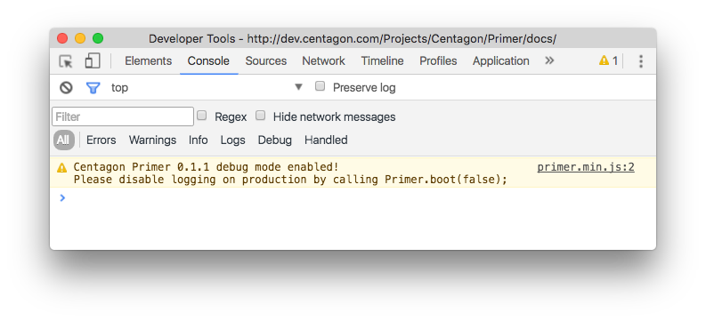
By defaults, Primer boots into production mode disabling all console logging.
To counteract this behaviour just must pass true as the first argument on
the boot method. This also enables console logging but also adds a warning
message to the console like the one below:
Anchor
import Anchor from './lib/Anchor';

// Register rel=external handlers.
Anchor.registerExternals();
Equalizer
import Equalizer from './lib/Equalizer';

const equalizer = new Equalizer(selector = '.equalized');

// Register/boot the equalizer
equalizer.register(scope = window);

// Reset all equalized elements
equalizer.reset();
Form
import Form from './lib/Form';

Form.registerSwapHandler(selector = 'data-state-event');
Lazy Loading
import LazyLoader from './lib/LazyLoader';

new LazyLoader(selector = 'img[data-src]');
Scroll
import Scroll from './lib/Scroll';

// Create a new Scroll instance that triggers
const scroll = new Scroll({
    threshold: window.innerHeight / 2,
    onBeforeThreshold: () => console.log('Before the threshold'),
    onAfterThreshold: () => console.log('After the threshold')
});

// Animated scroll to a certain position on the page
Scroll.to(offset, speed = 250);

// Get the current scroll position in pixels.
Scroll.getPosition();
Social Media
import Share from './lib/Social/Share';

// Import all available networks.
import {
    Facebook,
    LinkedIn,
    Twitter,
    Xing
} from './lib/Social/Networks';

// Create the sharing registrar instance.
const share = new Share(selector = '[data-social]');

// Register the sharers.
share.register('facebook', Facebook);
share.register('linkedin', LinkedIn);
share.register('twitter', Twitter);
share.register('xing', Xing);

// Boot the sharer and attach all needed event handlers.
share.boot();
Utilities
Util.Element
import { Element } from './Util';

// Get the elements computed styles
Element.getStyles(document.querySelector('.my-element'));

// Get a specific computed style.
Element.getStyle(document.querySelector('.my-element'));
Util.Orientation
import { Orientation } from './Util';

// Get the current device orientation
Orientation.get(); // portait / landscape.

// Listen to the orientation change event and execute a callback.
Orientation.onChange((e) => {
    console.log(`The orientation changed to ${Orientation.get()}`);
});
Util.Visibility
import { Visibility } from './Util';

const element = document.getElementById('my-awesome-element');

// Determine that the element is visible.
Visibility.isVisible(element);

// Determine that the element is hidden.
Visibility.isHidden(element);
Util.Window
import { Window } from './Util';

// Open a new popup window
Window.open(url, width = 600, height = 450, center = true);

// Listen to an resize event and execute the supplied callback.
Window.onResize((e) => {
    console.log('The window is resized.');
});
Util.String
import { String } from './Util';

// Decode a string into an object.
String.toObject('a=foo&b=bar'); // { a: 'foo', b: 'bar' }